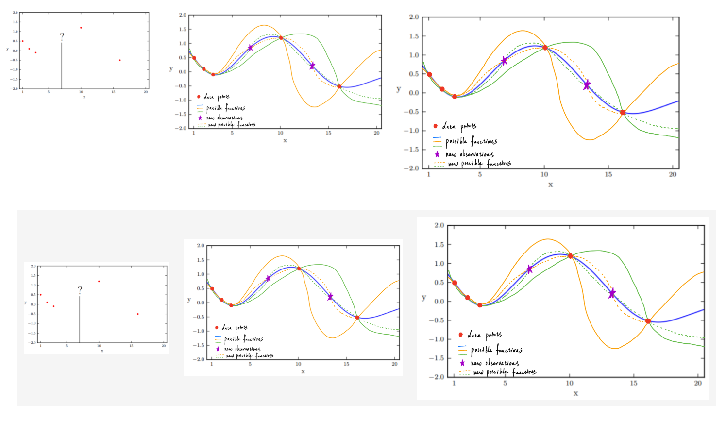
Put Images Side By Side In GitHub Markdown
Published:
I’m trying to display images side-by-side instead of top and bottom in Markdown. Here are two methods I recommend after testing online methods.
Acknowledgement: the codes in this blog are from Place Images Side By Side In a Post.
Method 1. Flex Boxes
<div style="display:flex">
     <div style="flex:1;padding-right:10px;">
          <img src="img/image1.png" width="200"/>
     </div>
     <div style="flex:1;padding-left:10px;">
          <img src="img/image2.png" width="300"/>
     </div>
     <div style="flex:1;padding-left:10px;">
          <img src="img/image3.png" width="400"/>
     </div>
</div>
Method 2. Flex Boxes
<div id="image-table">
    <table>
	    <tr>
    	    <td style="padding:10px">
        	    <img src="img/image1.png" width="200"/>
      	    </td>
            <td style="padding:10px">
            	<img src="img/image2.png" width="300"/>
            </td>
            <td style="padding:10px">
            	<img src="img/image3.png" width="400"/>
            </td>
        </tr>
    </table>
</div>
The padding, padding-left, and padding-right are used to adjust spaces between images. The width is used to adjust the image size.
The outputs of the two methods are little bit different, method 1 and method 2 outputs are shown respectively. Method 2 automatically centers the images while method 1 doesn’t. Method 2 has grey background while method 1 doesn’t.

